Added Professional Print Touches for the New Year

Whether your customer is updating their existing print order or creating something entirely new, the New Year is a good time for them to add a bit of extra polish and professionalism to their suite of stationery products. How can they do that? Here are our four tips.

1. Coordinate
Nothing says “You are in good hands” quite like a well-put-together appearance. From employee dress to consistent signage, your customer has probably considered this already, but they might not have considered the importance of coordinating their image across their print pieces, too.

That doesn’t mean that everything has to match exactly, though. The design they print on white letterhead for everyday use, for example, could feel more stately on an ivory stock. And speaking of ways to make designs feel consistent without making them match exactly…

2. Let Brand Colors Take Center Stage
Whether or not your customer wants to put their logo on a given print piece, using their brand colors for every piece is a good way to make every print piece they use feel like a cohesive whole. For some pieces your customer could highlight their logo, but others could simply feature that logo’s colors to create a different look that still connects back to their brand.

3. Don’t Be Afraid to Get Creative
Sometimes changing things up is a great way to pull together a more creative set of print pieces. Does your customer have an abstract or geometric logo? Consider printing it very light across their letterhead for the look of a watermark or letting it extend beyond the cut edge of their business card for a creative accent. Does your customer usually use their logo as the central design in their print—except in one photo-heavy brochure? Consider using that logo as an accent or highlighting it on the back of the brochure alongside your customer’s contact information.

This creativity doesn’t just add visual interest—it allows your customer to be more flexible with their print pieces. After all, with a little bit of flexibility in their brand look, they can create a wider variety of designs for their print.

4. Consider Texture
One way to bring together your customer’s print pieces with style is to use only one or two stock textures throughout their print order. Using the same stock to unify your customer’s business cards, letterhead, and stationery envelopes is a great way to give everything a consistent feel.

And, for additional polish, Navitor offers CLASSIC® Linen and Laid Papers. Not only do these stocks provide a subtle texture that will add a touch of elegant appeal, but the CLASSIC® brand is one that your customers can rely on. Choose linen papers for a cloth-like texture and laid for a handcrafted feel. To learn more about these stock textures, check out the Neenah website for more information on CLASSIC® Linen and CLASSIC® Laid.

How do you help your customers create a polished print order? Do you help them coordinate their print pieces? We’d love to see your tips in the comments below.
Check Out Label Sales Tools in 2019

Happy New Year! Now is the time we all say ‘Hello 2019’ and ‘Hello’ to creating this year’s plan to target new label, decal and sticker sales growth. Go ahead and mark it off your ‘to do’ list because Label Works already has the plan taken care of.  Check out our FREE, ready to use sales tools below to see how growing business is really as simple as 1-2-3.

First off, we all know clients love seeing materials that speak directly to their market, day-to-day needs and goals. So why not use a sales presentation that does exactly that? Just use and repeat the steps below for any vertical you’re targeting this year and ta-dah your presentation is ready!

  • Zoom Catalog – Use this resource to re-brand our free marketing pieces with your own company name and logo. Your individual sales reps can also customize these with their contact info. Start with our e-catalog then move to one of our many Sales Flyers. These flyers highlight types of labels, their uses and available options for each market. Simply find the customer type that you’re speaking to, create a PDF of the flyer or print it out and share!
  • Physical Sample Kit – Gone are the days of having to show your customer samples that do not pertain to them and trying to get them to use their imagination to fit them into their world. Our sample kits are designed to include stickers that speak to specific markets. As you open the kit, you can share how every label within it speaks to your customer specifically. Ideas will start flowing! How cool is that?! These kits make a wonderful tool to mail out directly to customers as well.
  • Vertical Market Deck – We all love happy endings! Our vertical market deck, made up of 18 different 5 x 7” post cards, provides you with a success story to share with your customer that is relevant to their industry. Not only that, it is also an end customer facing piece that shares various label ideas and benefits that will help spark additional conversation. How do you use this tool you ask? It’s easy! Simply pick out the card that matches the industry you’re meeting with, pair it with the branded sales flyer and physical sample kit and you have the perfect presentation combination! Keep this tool at your office, in your vehicle or even utilize the e-version that is available to share via email!

One important key to growing sales in this product line is to simply make sure your potential and existing customers are aware that you sell it! Whether you like to call them labels, stickers or decals, we’ve got you covered. Using the above tools, as well as help from your label expert team at Label Works, makes this easy. Happy Selling in 2019! We’re excited to partner with you again this year!

Label Works Receives Premier Print Award, Certificate of Merit

Label Works PIA Award

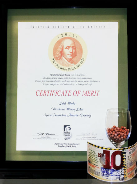
Recently, The Premier Print Awards, presented by Printing Industries of America (PIA), were announced with Label Works winning a Premier Print Award – Certificate of Merit in the Special Innovations category for our Warehouse Winery label.

Creating eye-catching labels for customers is a source of pride for Label Works. When Warehouse Winery requested a distinctive look for their labels, the Label Works team knew that full color printing using Color-Logic’s Process Metallic Color System was the perfect combination. With Label Works being one of only three certified label printers in the United States to offer Color-Logic, Warehouse Winery’s labels would truly stand out as Color-Logic label printing is extremely limited in today’s market.

Color-Logic Partner

The Color-Logic system allows printers to create up to 250 different metallic colors in a single print run along with different effects such as gradations, watermarks and dimension; when applied to labels, the system allows customers to have a unique looking label printed without the expensive costs for foils, embossing or dies for different shapes. Traditionally, printing with metallic inks or trying to create a metallic effect with two or more colors is difficult; with Color-Logic, the Label Works’ designer manipulated portions of Warehouse Winery’s design to incorporate metallic effects while allowing the rest of the label to print as a traditional full color label. During this process, Label Works created several different designs for the customer to review using a variety of the effects offered through Color-Logic so the customer could choose the appearance that most appropriately displayed their ideas.

The label was printed digitally on an HP Indigo 4500 with the Color-Logic Enhancements; the final printing included four color process plus white ink and a matte UV Varnish on silver stock.

Label Works - Wine Warehouse

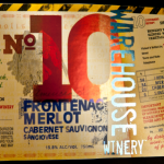
Against the matte finish, the Color-Logic effects pop: the metallic red of the “No. 10”, the metallic blue for “Warehouse Winery”, the green and purple seal on the lower right side and the raven holding a cluster of grapes to the left of the “10.” With Color-Logic, Warehouse Winery could add the effect of having the bottom of the “10” appear with a metallic effect while not interfering with the wine type “Frontenac Merlot” in dark blue below it.

For more information on how Color-Logic can help create eye-catching labels for you, contact Label Works today!